Maison Margiela 6
Drawing inspiration from the deconstructed silhouettes and tactile storytelling of Margiela, we approached the typeface design with a brutalist mindset. Brutalism, like MM6, is about stripping away the unnecessary, exposing the raw structure, and challenging expectations. The resulting geometric forms disregard traditional typographic conventions, creating an unyealding visual vocabulary.
Type Design
Niklas Ekholm
Niklas Ekholm
Art Direction & Design
Tony Eräpuro / Studio Erapuro
Tony Eräpuro / Studio Erapuro
Custom Type Design for
MM6 Maison Margiela
MM6 Maison Margiela
Photography
Courtesy of mm6
Courtesy of mm6
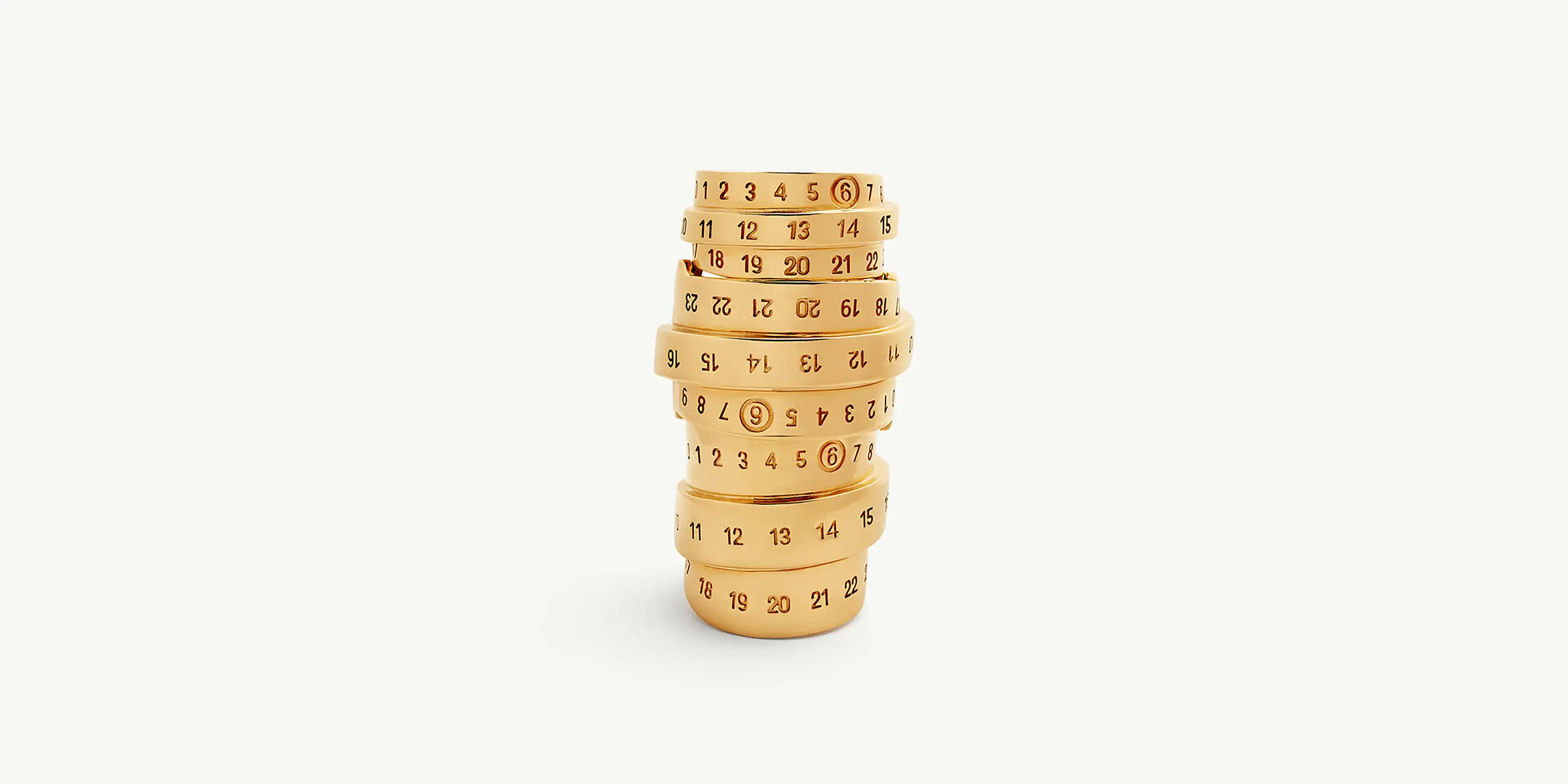
We pay homage to the earliest Martin Margiela catalogues, designed by Åbäke, where type was more than just communication—it was a punk manifesto. Just as those catalogues embraced an unconventional, industrial aesthetic, this typeface channels the same defiance, stripping type to its raw geometry while maintaining a striking presence. The typeface reflects the MM6 ethos: an embrace of the unconventional, a rejection of excess, and a focus on functionality that dares to question beauty. Its bold, monolithic shapes echo the deconstruction inherent in the Maison’s garments, while its precise geometry mirrors the architectural quality of Margiela’s recurring themes. This is not just a typeface; it is an object of disruption. A refusal to blend in. A statement of quiet audacity.
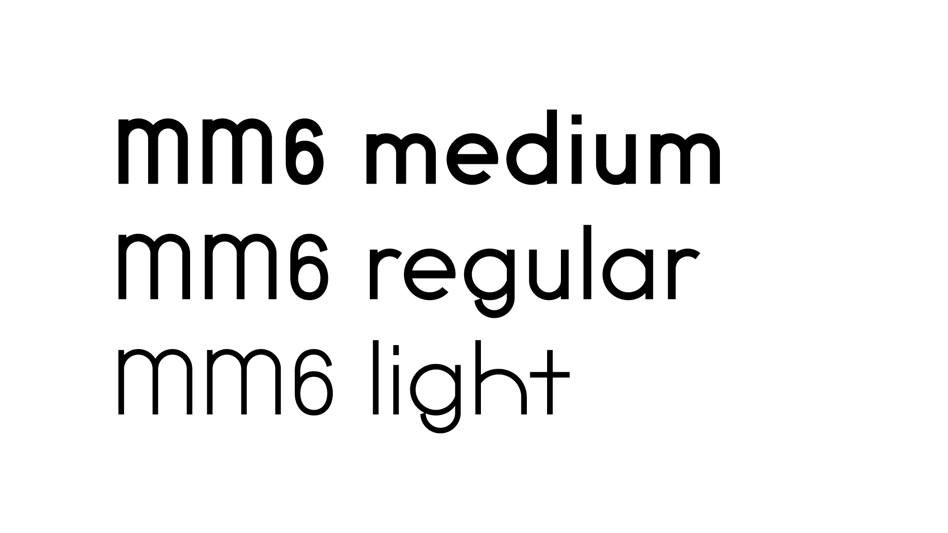
The MM6 commission offered an opportunity to finally complete a long-running idea: expanding Absolution into a full weight range. Though new weights had long been in development, they had never been published — until now. For this version, we developed a new variable axis and selected three precisely calibrated weights for ease of use in the final font. These styles carry the same structural clarity as the original, but each lands with a different voice: the Light reads like a notation, almost hesitant; the Regular is more neutral, a base to build on; and the Bold adds emphasis without shouting. The progression is minimal but intentional — designed to serve both expressive typographic moments and systematic brand work.
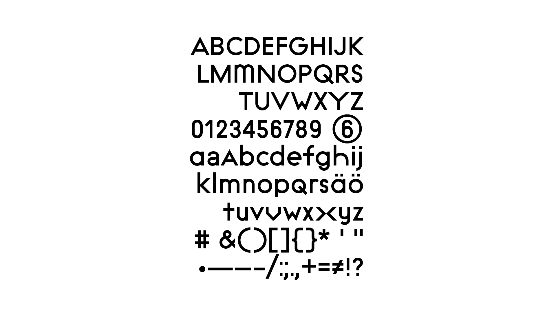
The MM6 typeface lives in the space between system and idiosyncrasy. It’s built to function — clear, legible, and adaptable across materials and formats — but carries just enough personality to suggest that someone, somewhere, made decisions by hand. The design resists both neutrality and flourish, instead opting for a kind of purposeful restraint. In its final form, it feels less like a signature and more like a tool sharpened through use — one that fits quietly into the MM6 world, where garments are numbered, tags are exposed, and the construction is always part of the story.